Showing posts with label review. Show all posts

Monday, 27 April 2015


Here are the videos i used in one of my instillation tests, the first one was about dizziness, my theme was going to be madness as I believed they link well.
The second one was to show the madness in doing nothing or feeling like the screen is lagging.

however with time I found the images too dull, they were very similar as they were in one place and with the same character
This was the result of rushing to have a finished piece however once I had finished it I felt it was severely lacking, so instead I used it as a learning curve, I learnt how to merge videos, speed up and slow down from this which are all useful things to lead me to my real final piece

Though I do like the big reveal on the eyes as the video behind had eyes near the same level, it gave an wary effect that fits in with madness.

I had people sit on chairs looking at the ceiling, I then spun the chairs and made them try to walk down the hallway, I could fit this into madness because or the dizziness and confusion as well as the inability to walk in a straight line, i.e life is hard
I decided too try and dull the colours by tinting the video clips a brown colour so it looked old fashioned, to try and fit the music some were darker to show the harshness, the darker clip was actually an accident when recording, someone who had just been spun ran into the radiator before dramatically sliding to the floor so I decided to keep it in for this one, to show that the dizziness is not good.
the dramatic music in the background is from a game called amnesia the dark descent but played slower and backwards

This is my final video, it has a lot of changes from its first one. with a happier feel to it than before, no colour tints this time to show off the vibrant colours.
This one still fits in with madness because they know how they will feel after being spun, the dizzy nauseousness, but yet they still go through with it like a drug almost. 
The sounds playing are the laughter recorded while they were being spun or when they were walking, this is to test the theory that laughing is infectious, when you hear someone laugh you are more likely to laugh with them, however the sounds are not from the clip they are playing along, they have all been mixed up so some guys have girls laughing and some girls have guys laughing because I find that funnier.  
I do like this video and am proud of it however I think I could improve next time by recording in a more open space like outside or in a field and record more sounds to be played in the background of the video, but i think i did well in trimming, placement and variation.

Sunday, 26 April 2015

Plans and practices

Here are my practices on the Canvas' I made using MDF cut 44 width and 61 length, then covered by a strong durable fabric over one to make a canvas, the other remained without the fabric to test texture and to just make sure it was the right effect.

 This one was first to do, I used just the primed MDF board for this, I also tried to do a Jim Dine technique for the background to keep it visually stimulating, i liked the idea of now worrying about the colours within the colours, for example if you look at some of the yellow boxes you will see some blues, pinks and browns mixed in almost carelessly, but it did give off a nearly 3D effect, however if i were to do a similar background in the future, i would not use the dabble technique, it doesnt look right so i will keep it smooth.

Then I had Julian Opie faces, or tried to, with the very limited details on the face, it was almost the exact effect i wanted, though i wish the lines were darker. One thing i am disappointed with is how small i made the faces, yes i wanted the background to be visible but now there is too much background, so for my next idea i will make sure to make the characters alot bigger!

I have decided to keep the lips big and exaggerated as my sort of signature mark that people may recognise.

This was from an argument between Danny Dyer and katie hopkins in which he called her a tampon with a face after she lashed out at his fiancee

“Last one.....as I'm in a jolly good mood.....imagine if a tampon was to have a face......@KTHopkins happy Tuesday. ;)”

I erased the last head and body because of my previous review of it being too small, though the lips weren't as realistic, but in my eyes it looks like he is pouting which is funny to me.
From some research i did later on I went back and edited the background so that it would have these thick black lines, however i found it blended in too much with the lines in the faces, clothes and tampon. I would need to take this into consideration for next time.


In a tweet from Katie Hopkins she said that if Ed Miliband was voted the new pm she was going to leave the country, i found this funny because some people on the internet would then intentionally vote for him to spite her making it a possibility.
I first decided to blend some colours,  thought that this effect looked interesting and simple, i dragged the brush off of the page in a curtain angle and added a bit of colour each time without cleaning the brush, though this also lead me to another idea;

I decided to try and make a universe, seeing though Ed was stood on the world with Katie running away, it would only make sense for their background to be the universe around them, though this makes it too literal, so instead i tried to find a different background type in which it emphasises the people and does not make them blend in.

 To simplify the background i used a technique of another artist; Kim Moore, one of her techniques is to scrape paint onto canvas with a spatula, giving a textured effect which i wanted to try and replicate, I think the paint was too watery and you could still see the failed attempt at a universe in the background lightly, though i do not mind it, it gives an added colour, i had fun using the spatula though i do not think i will use this technique again.

However, when I left it to dry it dribbled from the angle it was at, though it looks interesting, it was not what i wanted to happen.


This one is not finished however I tried to do a different background to the first image, trying to use black and white to emphasise the colour in the foreground however i am not sure it is right, perhaps i will keep the idea for a future design except keep it more the patch work style of Jim Dine instead of the floating TV screens we see here.

I did learn from my mistakes last time and made the characters alot bigger to take up more space, even giving them a more unusual position to make them more visually pleasing.

This Idea is from a celebrity argument between Katie Price and Katie Hopkins, in which Katie talked to the press saying 'I bet she doesn't even wear face cream' which i found hilarious because it just wasn't the sort of back talk you would expect. At the moment it seems to be a series of Katie Hopkins seeing though so many people make ridiculous comments.

I do think i will stick to celebrity arguments or social networking posts for my final piece.

I decided this would be my final piece once finished.


Here is the finished piece, i decided to change the background to grey so that it did not draw attention from the main image however i also changed the lines to white to make them stand out against the black

Review

I have changed a lot about my designs and here is a list to some up what they are about;
  • What my brand would be on; T-shirts, key rings, mugs and phone cases
  • Brand Name; Busy Birdie
  • Visuals; Bold colours and birds
  • Audience;Teenagers 13-18
  • Relates to; Play on words and birds.
  • Wanted for; Bright, funny and different

Thursday, 2 April 2015

These were my first attempts at making concept sheets, they were too busy and used up too many colours which would be difficult to read for some people, the logo also changed so it would look more interesting and would not draw attention from the wings and/or to be easier to print by hand as a cheaper alternative to commercial printing.


Here are a few designs on hats to show how my designs can be fit for anyone to wear or have.

Tuesday, 3 February 2015

Presentation reviews

I will write what i gathered from their presentation, after that i will write what they can do to improve

Matts

The 1950's were marked by economic growth, american wages went up by nearly 50%

As well as the cold war job opening jobs for Illustrators to make anti communist propaganda, they were a necessity during the 1950's for their link to advertisement, creating positive and bright posters.

Dr. Suess was one of the most well known illustrators of his time.

in matts presentation it was quite knowledgeable however, he spoke to fast and nervously as well as only reading off the board, it was hard to jott down.
He could improve by looking into different branches of animation, what other types were around in 1950's?

Kim

1953; fashion was sleak,

Ideal body shape was large hips, thin waist. waist bands were very tight to emphasise even with though it would be most uncomfortable for some

Rationing was no longer a problem so finer materials could be used.

Bras were sharp and pointed, not sure why they seem so dangerous.

Look into possible colour changes through the years, perhaps pastels were used for some part of the year then bright obnoxious colours then dark or so on, i have no research into this side.

Elicia


Her research was more into unusual flats, for example 'the slums' in sheffield which had started being taken down but with money being a problem the plans were scrapped and the building is still up now.

I would say she may need to look into different types of buildings, not just their appearance but perhaps placement, what keeps them up or how they make her feel personally.

Jordan 
Animation had really flourished within the 1950's disney released such films as;
Cinderella 1950
Peter Pan 1953
Sleeping Beauty 1955

Many characters that are popular today had made their first appearances;
Bugs bunny
Betty boop

Loony toons became a regular show on daytime TV

Racism was a big thing, even in animation, for example in loony toons, racial drops were made.

I like how he listed everything out in his presentation, however it may be a good thing to look into some non-drawn animation such as stock motion, like that in seven voyages of simbad.

Emma

Jackson Pollock, his technique is dribble or splatter using paint brushes mainly.
1930's he started drawing in a regionalistic style.

Influenced by thomas Benton, Diego Rivera, Lee Krainer, William De kooning

1946-1951 is when he started to express himself through his work which is when his technique comes in.

Mark Tobey 1890-1976, learnt calligraphy which is what inspired or tied into his work very often.

I think she did a very good job looking into Jackson pollocks life however it seems that was all she looked into, it may be best to broaden your search into some of the people he was influenced by or who he influenced.
also give a personal outlook to his work, how it makes you feel.

Stacy

She looked into makeup effects in the 1950's which led her to 'The Creature From The Black Lagoon".
The suit was made of foam rubber, it was not heavy because of this.

the swimming and walking scenes of the creature were done by two people, the swimming guy had no way to breath underwater from the suit, however he could hold his breath for nearly 4 1/2 minutes

The suit turns to dust with time.

I think she did a good job, she could have looked at the audience a little more but the main thing to improve on would be to look into what the film was inspired by, or the creature, and from that she could look into other creatures and hear their stories through inspiration.

Becky

Photography was mostly used for commercial use, however there was a lot of sexism in this time, women were treated as objects in the media, or that they were all dumb as well as in films
Commercials were different in the 1950's I.E smoker and guns were advertised as if they did not care

I think she did well however she could have had more information into artists or events around that time that were good with photography. possibly look into the sexism, did women really care? or  was it just dulled out because it was a common occurrence in advertisement?

Sunday, 1 February 2015

Caricatures- Satire Art


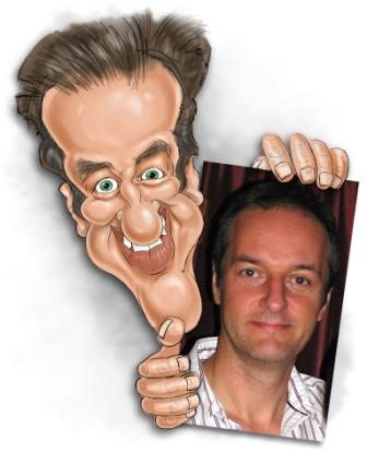
Tom Marriott

Apparently his love for drawing started off from the age of 5, which he used to try and get out of trouble, his grandfather bought him some egg and spoon wall paper that, one night, he decided to take chunks out of, the guilt of what he had done made him try to disguise it by drawing them back on the missing pieces, his parents found it hilarious so he kept it up.

He does Pastels, Digital and Pencil caricatures and can be hired for weddings and special events


http://the-caricatureartist.co.uk  


Here are  a few of my practices;


I have to say I am quite proud with how Justin Biebers caricature turned out, the one on the bottom left was the final image I made and I can definitely see the improvement, i also tried one of my other ideas which was to have celebrities with rabbit or animal faces.


For Katie Hopkins I went over board with trying to exaggerate her to the extreme as just a test run, i find the big lips and small button eyes amusing for a caricature and may be my favourite part. however i was never quite happy with he neck, I may need more practice.

And here is an inked Simon Cowell, well known for his trousers being too high and his usually blunt outlook, I tried to see what effect it would give to have rosie red cheeks like a doll as well as the big mouth and button eyes however i do not think i will continue it, or the button eyes it would be too simple and i would like to challenge myself a bit but who knows this plan may change.

unlike my other designs i was not able to finish this one so i decided to take into account that i may have a time limit for my final piece and that i would need to practice quick sketches or caricatures to prepare myself.

This one was done in microsoft paint and with a graphics tablet, i had started getting the habit of drawing the big exaggerated lips, which i find kind of funny, i may follow this on to my later designs.


Here are some of the quick sketches and caricature work i did as practices, though caricatures are funny looking i think it may be best to look into what i am satiring, making people look funny isnt exactly a strong piece so i will look to the media and celebrities for help.

I used pro markers for these and they do give off a smooth look which i really like.