Showing posts with label Unit 50. Show all posts

Tuesday, 27 January 2015

1950's Advertisement

While world war 2 was happening, trade routes were restricted or even cut off, meaning rationing had to take affect, anything that was being sold had to be necessary, to stay running shops had to compromise, for example porcelain shops could only sell 'white ware' completely colour and patternless therefore not using any unnecessary materials.

After the bombing raids which mainly aimed at places such as factories, cultural and religious places as well as crowded areas, meant that there was a huge need for quick housing which were well made considering they were supposed to be temporary, some lasting 40 years.

1950's, also known as the year of the consumer was a big year for shops of all kinds, because rationing was no longer an issue as well as households starting to have spare money, which took a lot of self control to keep, thanks to the beauty of funny, sexist, incorrect in today's society or/and bright advertisements of the 1950's.

"In a single generation, lingering memories of the Great Depression and war were replaced by positive futuristic portrayals of the idealized modern family"  Website

It was one of the first time children had started to be targetted by advertisements, 'Pester Power' had become a great way to drag parents into buying things they would other wise would ignore. 

Sexism
We are all fully aware there was a lot of sexism going on around this time, women were not supposed to do any work seen as 'mans work' it was only during world war 2 where there were no men to work in the factories so women can prove themselves. it wasn't till 1960's-70's that women were treated with more respect, this was the time were the civil rights movement was in place.

Men and women had grown so used to this stereotypical house wives image of 1950's, sometimes it did get bad and objectified but because it was the norm no one really cared. this poster mas bright colours which are eye catching, and yellow is supposed to be the colour to subconsciously make you want something, however implying women are so fragile or stupid in its text will make the husband want to buy it, this means that this advertisement has been directed to the male audience more


smoking also wasn't a big deal, we know now that there are many dangerous that can happen from smoking, but back in the 50's people just didn't know or want to look into it, advertisements were positive, no one wanted to be in a bad mood because they had been passed such a bad point, the more positive sounding something is the more likely people were going to buy them.


Everything in this video was happy, cheerful and full of wonder and smiles.
For advertisement, the most common or popular sources were newspapers, magazines, radio ads, Television was like a new leaf to the industry, it was possibly the most influential factor.


Wednesday, 10 December 2014

Logo redesigns

 
A few people who i asked to check out my packaging before and after said they really like the little character made from the & symbol, this made me think if i brought it back then it would only add to my packagings overall rating so i attempted to redesign the hush and shush logo, this was the one  i chose.

First I rotated the image and cleared it up using curves, levels and selective colour.


then i outlined and coloured with illustrator just so that it would remain bold and simple in appearing as well as the helpful smooth lines.


Product placement


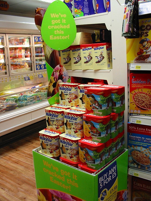
These were a few of my ideas for a point of sale, experimenting with materials, shapes and the possibility or actually creating something similar. I have chosen to do the one in the top left corner, because i can make it in sections, meaning it could be as tall or as short as the store owner may want.

here is my map of the shelves, doesn't look like much because they are actually quite simple to make.

Brand logo designs

  These are my attempts at making logos and backgrounds through photoshop.


I was testing out opacities to make this unusual overlapping effect, it looks pretty and reminds me of a kaleidoscope with the odd shapes and patterns.

This is what happened when i used Gaussian blur, I really loved the effect because of the soft tones and nothing was too bright or made your eyes focus or strain.
once had made a background i liked the look of i started messing with the designs, I really liked them in primary shapes like circles and squares.


I really did like this background, but sadly it was the name i decided wasn't up to par, it was too long, so i thought it was the right thing to do, something short and relative.


Tuesday, 2 December 2014

#My Product#


My first  practices of the Title for my product, using the names of the characters instead of creating something new because I wanted it to be catchy, relevant and cute, the names Hush & Shush worked well because 


A few InfoGraphics I did in Adobe Illustrator, to show the use of my product, the last ones are the ones I stuck with because they are simple and friendly looking.

For each box, the girl will have a different coloured shirt depending on the secondary colour of the packaging (AKA the colour of the flaps and writing.)


The first design of my product, I chose a handwritten looking type face and simply change the & into a friendly character, at the time i felt it was cute and cleaver but now I realise it wasn't very  impressive, that and some people may stubble to distinguish between letters, I know what it says because I wrote it but it would probably be a problem in later development and testing.
I wanted to use a simple box template for my product because I wanted to focus more on the graphics, for example the title and imagery that will cover the friendly box.


Second design for my product packaging, I decided to write my own font, trying to make it look friendly and cushioned, huggable, knowing this i was trying to make the text thick, and thanks to my inability to write anything in a straight line it would make it look bouncy, as the letters are not on the same level.


My Final (hopefully) Packaging design, 


Special Editions

For Pine I felt it would better suit christmas, as it tends to be pine trees that are put up in the middle of houses and decorated festively, red being the current colour of santa's crown though it did used to be green, so to stay with the times i decided Red would be the best secondary colour for it. the brown actually being taken from a mixture of images of pine cones.

A valentines Edition, because who wouldn't buy their sweet heart something cute and cuddly?
The Primary colour was taken from a rose, the secondary colour was taken from the leaves to show relevance, lucky I have the eye drop tool, I wasn't expecting to get this colours I am actually quite happy that I did.