Showing posts with label Product. Show all posts

Sunday, 26 April 2015

Review

I have changed a lot about my designs and here is a list to some up what they are about;
  • What my brand would be on; T-shirts, key rings, mugs and phone cases
  • Brand Name; Busy Birdie
  • Visuals; Bold colours and birds
  • Audience;Teenagers 13-18
  • Relates to; Play on words and birds.
  • Wanted for; Bright, funny and different

Thursday, 2 April 2015

These were my first attempts at making concept sheets, they were too busy and used up too many colours which would be difficult to read for some people, the logo also changed so it would look more interesting and would not draw attention from the wings and/or to be easier to print by hand as a cheaper alternative to commercial printing.


Here are a few designs on hats to show how my designs can be fit for anyone to wear or have.

Sunday, 15 March 2015

T-Shirts


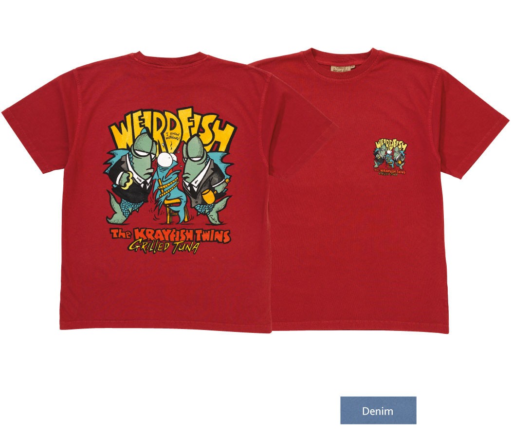
I personally love weird fish designs, and their logo, which is easily recognisable as a weird fish.
or a skeleton of a fish, the sketchy writing is also weird in a sense it seems hand written with a slightly shaky hand.
'Live Life Your Way'
A very positive message to send out, and catchy, people may subconscious remember the quote but not link it with weird fish as i do.

http://www.designious.com/t-shirt-designs
This website has many cool designs to buy, they are not all characters, which makes me think i should not box myself in with only caricature designs, i will probably come back to caricatures with time but right now i need to broaden my search

http://www.redbubble.com/shop/womens-tshirts?ref=home_leftnav https://www.etsy.com/uk/search?q=t-shirts 
Redbubble and Etsy are both better known to me, though they do not all look into T-shirt designs only, which is what i like about them, usually their are alot of work based around certain fandoms (fans of TV programs or webcomics/videos on the internet) for example a character on a T-shirt will be from that particular show or be 'fan made' E.I. based on the universe of the show but not in it.

Saturday, 27 December 2014

A look into Label's and Net's for Hush&Shush

For my Hush&Shush packaging

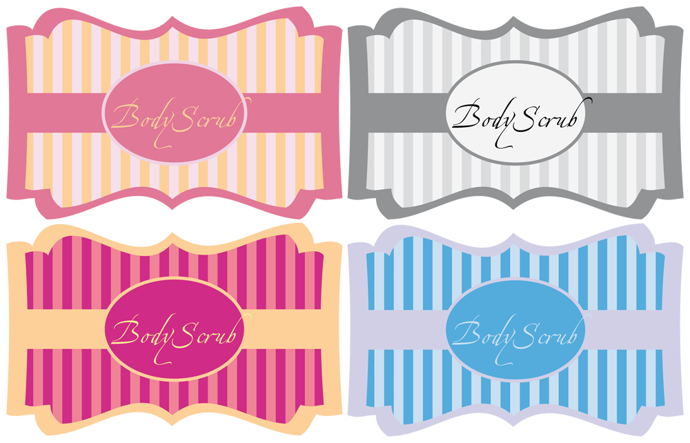
Though the bears do not suit labels i thought it would be good to have a little look at a few, perhaps the colours/shapes or form would inspire me.


However after much consideration i believe the bears should be in a more simpler box or rectangular net, thus being able to stack and craft easily, though looking at a few of the labels above i do like the idea of a quirky character info graphic and the use of light but bright colours.

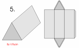
I like the idea of the little window in the box, the box itself however is too complicated i think, it may be a hassle to open and if the customer wanted to keep the box it may not be in the best of condition, i  may try it out never the less just so i can say i have.
I would like to focus on this template for my product, a simple rectangle with lots of blank space to add to without it looking too overcrowded with writing people couldn't otherwise see.

Wednesday, 10 December 2014

Logo redesigns

 
A few people who i asked to check out my packaging before and after said they really like the little character made from the & symbol, this made me think if i brought it back then it would only add to my packagings overall rating so i attempted to redesign the hush and shush logo, this was the one  i chose.

First I rotated the image and cleared it up using curves, levels and selective colour.


then i outlined and coloured with illustrator just so that it would remain bold and simple in appearing as well as the helpful smooth lines.


Product placement


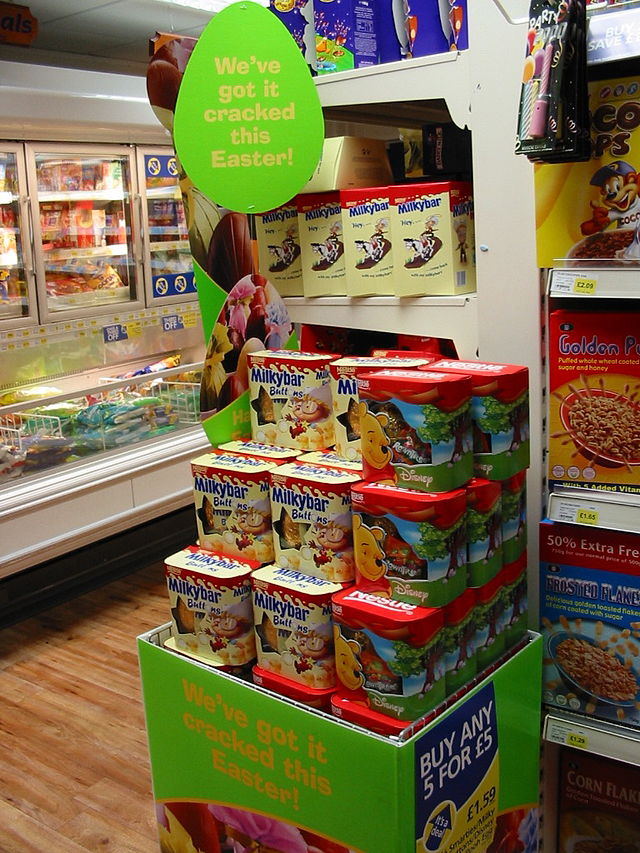
These were a few of my ideas for a point of sale, experimenting with materials, shapes and the possibility or actually creating something similar. I have chosen to do the one in the top left corner, because i can make it in sections, meaning it could be as tall or as short as the store owner may want.

here is my map of the shelves, doesn't look like much because they are actually quite simple to make.

Brand logo designs

  These are my attempts at making logos and backgrounds through photoshop.


I was testing out opacities to make this unusual overlapping effect, it looks pretty and reminds me of a kaleidoscope with the odd shapes and patterns.

This is what happened when i used Gaussian blur, I really loved the effect because of the soft tones and nothing was too bright or made your eyes focus or strain.
once had made a background i liked the look of i started messing with the designs, I really liked them in primary shapes like circles and squares.


I really did like this background, but sadly it was the name i decided wasn't up to par, it was too long, so i thought it was the right thing to do, something short and relative.