I looked into Artist Julian Opie and his simple way of making faces and tried to do the first designs for my logo with that technique
His work;
What I did
Though quirky these designs didn't give the effect I wanted, so I started thinking of fun play on words
Here are Shirt designs- or maybe even logo designs for my brand
I imagined that this logo is for girls 13 and below, the friendly pink pigeon would need a male counterpart which will be blue as a steriotype, but because this is the target audience, and does not actually say boy or girl on it can easily be for bother genders.
I took a vote in my class to see the most popular one of the 3 designs, as you can see the top design won by a land slide, however I think the pigeon is a little too big for the text and will be corrected later on.
These Designs were for the second logo, Groovy Goose is for adults from 20 and up.
Here are my text practices for Duck logos, I have settled on Devil Duck, as it would be the simplist to understand and to draw out, I have no idea how i would have managed to draw a dyslexic duck except moving the letters around or making it hard to tell the letters apart, and demon duck would just be a longer version of devil duck, I think it was the right choice to pick Devil Duck.
Here are my designs as well as the chosen text, I decided on the middle one seeing though the vote was a tie, for this brand i would say the target audience would be teenagers from 14-19, the age of rebelion or being little devils.
This is a sketch i worked on for my product designs for my Teddy bears, the first image i did by hand, the second is when i scanned and cleaned it up a little
my idea was of course to join Shush together, but at the time i had ran out of space on my paper, and so i don't squash the letters i decided to just join them later.
this is what I got after i had gone over my designs on illustrator, i did this on illustrator instead of photoshop because i wanted the nice smooth lines, because I was advertising teddy bears, which are soft and friendly.
the & was merely a practice for illustrating text, showing it as a character as well as something with meaning.
I soon decided that having these seperate brands was too complicated for what i wanted, so instead I came up with making one brand but using play on words as the designs, for example Groovy Goose, Devil Duck, Pink Pigeon and so on would just be designs for the shirts not the over all brand.
Here are my practices and final design, which was done by hand, hiding a bird within the text to link back to my research on logos with hidden meanings
Here are a few of the designs on T-shirts, most I would like to keep except the image below v
An attempt at comedic design however I dont think it looks as good as the others
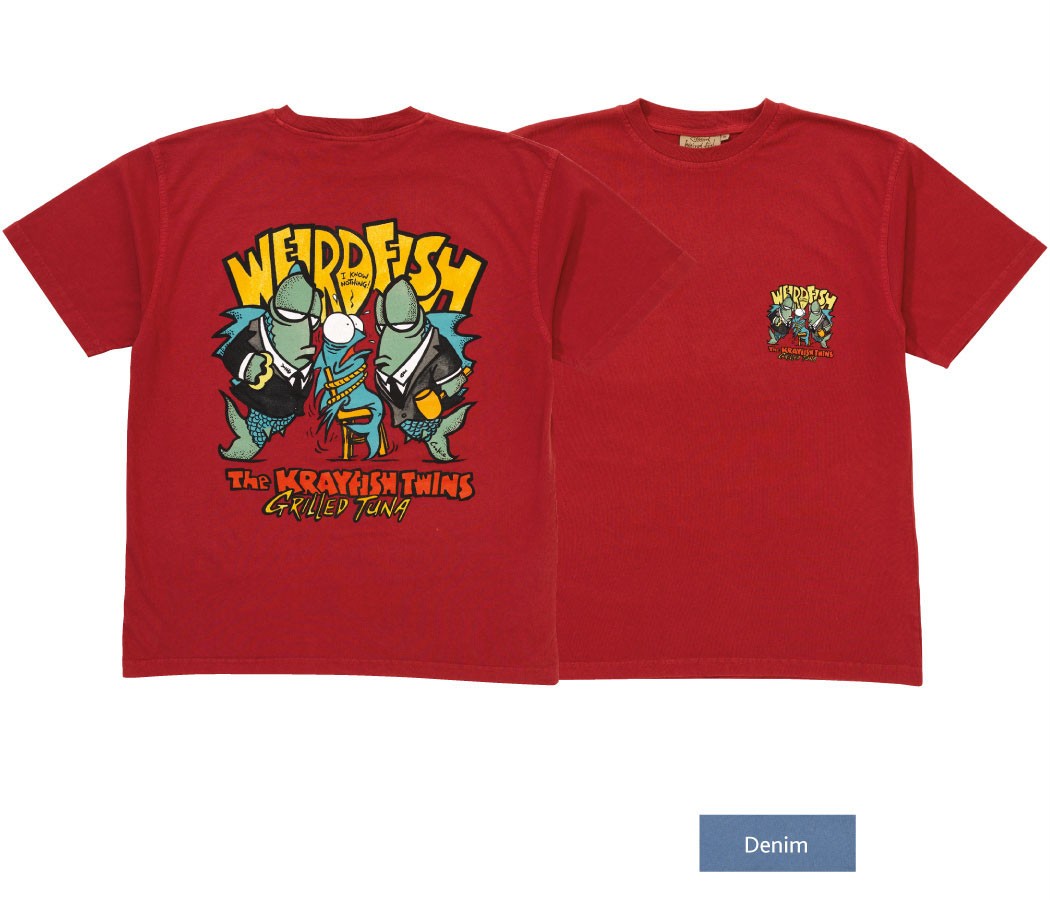
I personally love weird fish designs, and their logo, which is easily recognisable as a weird fish.
or a skeleton of a fish, the sketchy writing is also weird in a sense it seems hand written with a slightly shaky hand.
'Live Life Your Way'
A very positive message to send out, and catchy, people may subconscious remember the quote but not link it with weird fish as i do.
http://www.designious.com/t-shirt-designs
This website has many cool designs to buy, they are not all characters, which makes me think i should not box myself in with only caricature designs, i will probably come back to caricatures with time but right now i need to broaden my search
Redbubble and Etsy are both better known to me, though they do not all look into T-shirt designs only, which is what i like about them, usually their are alot of work based around certain fandoms (fans of TV programs or webcomics/videos on the internet) for example a character on a T-shirt will be from that particular show or be 'fan made' E.I. based on the universe of the show but not in it.
My original plan was to have designs that illustrate different puns and play on words, for example 'I would choose no otter' with a Otter holding another otters paw, something cute and most likely bought for valentines day but of course not all the designs would fit this category constantly, which is good, however the more I planned the quicker I ran out of ideas, so here are some research I have gotten of animals who I can use for designs
sea creatures;
Hagfish
The slime Hagfish Produce would make interesting patterns that could go into the shirt design, it may not need text or a pun, it could be entirely imagery
Basking Shark
Gulper Eel
From looking at the two images above i could imagin a story play out, not such a pun but more of a funny conversation over the frankly startled looking creatures.
Oarfish
Sea Slug
There are many different kinds of sea slug, so picking but a few images would never truly suffice, in my opinion they are quite cute and so i could use it as a different
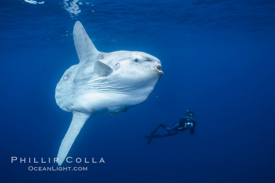
Sunfish
Seahorse
Monkfish
*All images and videos above belong to their rightful owners*
Birds;
Ducks
Chickens
Geese
Pidgeon
I decided to stick with recognisable birds as they are easier to mock or use, I could also get primary research into them unlike everything else I have chosen
Nazi Germany was as many already knew, full of useless rules to be enforced in order to make everything perfect, that meant as well as the jews, people with disabilities or different races would be rounded up and sent to camp, as well as thinkers; academics, artists, anyone who would be against or even know how wrong things were going, so many, many of them fled.
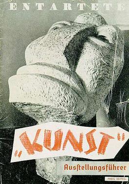
Soon a new order was passed in 1933, after the closure of the Bauhaus, for the removal of all art that would or could be classed as cosmopolitan and Bolshevik, this included abstraction in all of its forms, in total 15,997 pieces of such work was confiscated from around 101 museums, some of which were placed into the degenerate art exhibit where people were encouraged to go and laugh at all of the work.
The degenerate art exhibit mainly existed to show how no one is to fight against the government or they would be humiliated or worse, which is why people were invited into the museum in large numbers just to laugh and joke about the collected work. Everything was placed carelessly for its time, paintings leaning against the wall, crooked on the wall, writing was swayed, out of proportion or wonky, sculptures were put out of place just to make them look out of place or to make them look like trash, in our timeline this would be an exciting way to present work but back then this just represented careless behaviour or idiocy to kick the artists while they were down.
Bob and Roberta Smith
The brother and sister duo no longer work as a team, however patrick brill or better known by his alias bob, still uses the name, the contemporary artist mainly works with text and writing, his main goal in art is to show that all children should be encouraged to be creative before its too late and that the changes that are taking place should not go any further.
Abstract Expression
Experimented with in Germany by Wassily Kandinsky in 1919, became commonly associated with post war Germany because of the trouble some times in its history, it became a major american movement.
Influenced;
Surrealism
Cubism
It made colour and shape theory much more popular
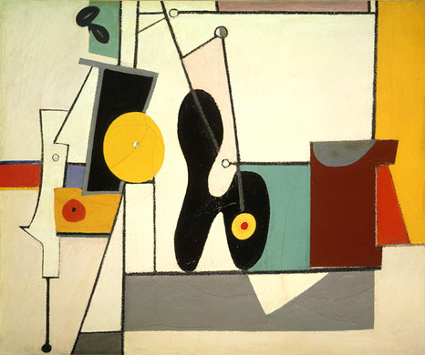
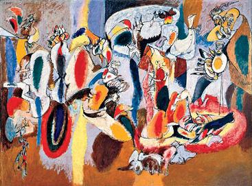
Arshile Gorky 1904-1948
His work is very similar to automatic art, where you would draw without having a set image in your head and then transform the sketches into something else, however his method was just to keep them how they were, only colouring in his work but keeping the odd shapes odd.
Jackson Pollock 1904-1948
Jackson uses his paintings to express his feelings instead of illustrating a point.
Willem De Kooning 1904-1997
Violent movement captured in his paintings, however it was thought he was a violent man around women and his own wife, sexism is strong however his work almost always shows a feminine form.
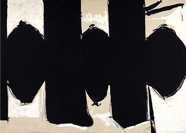
Robert Motherwell 1915-1991
Frank Kline 1910-1962
His paintings give off the impression of chalk, making marks that dont mean much, however they are huge canvases of just solid paint, the unusual shapes made are thought provocking and i personally really like it
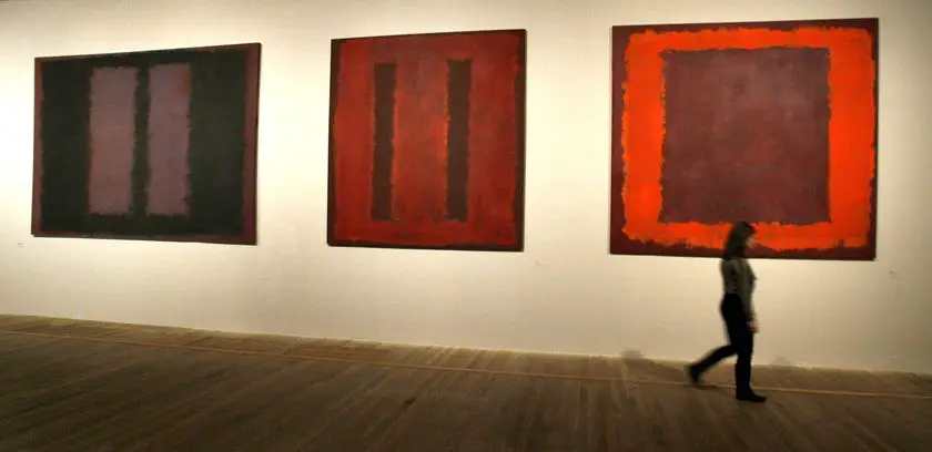
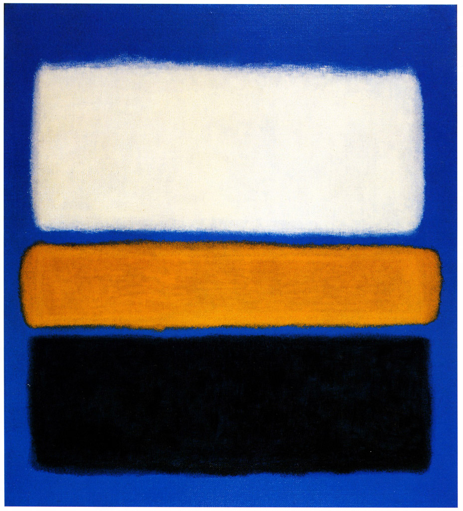
Mark Rothko 1903-1970
Jewish American artist, he would have obviously been through some of the harshest points in the nineteenth hundreds for jews, the obvious which was ww2 and the racism that happened within america.
I may try out this style in one of my plans, because it is quite thought provocking in choice of colour and shapes.
Hans Hofmann 1880-1966
Uses block colours to portray different effect, usually adding shapes to give the image more to process with our eyes
Barnett Newman
His work does seem to entirely be about him experimenting with colour theory and 'zips', the line of odd colour compared to the colours it separates- or attaches, which we can only guess was his intention, he just seems to conform or destroy the composition rules.
These are my attempts at making logos and backgrounds through photoshop.
I was testing out opacities to make this unusual overlapping effect, it looks pretty and reminds me of akaleidoscope with the odd shapes and patterns.
This is what happened when i used Gaussian blur, I really loved the effect because of the soft tones and nothing was too bright or made your eyes focus or strain.
once had made a background i liked the look of i started messing with the designs, I really liked them in primary shapes like circles and squares.
I really did like this background, but sadly it was the name i decided wasn't up to par, it was too long, so i thought it was the right thing to do, something short and relative.