The rainbow apple was scrapped as it was seen as too expensive to continue.
There were rumours that the bite in the apple was showing respect to the 'inventor of the internet' Alan Turing, who was sentenced for 'homosexual acts' which in 1952 were criminalised, he later committed suicide by eating a cyanide laced apple in 1954.
Though they were laughed at as being just “What a wonderful urban legend.”by the creator of the logo Rob Janoff According to him the bite was simply a play on word for byte, a unite of information in computing.
but there is also something else hidden in that logo, a phone, from the two empty notches to it, the bite and the bottom of the apple.
Personally I really like the logo and how simple yet thought provoking it is, I'm not sure how I would want to add this sort of idea to my work.
More illustrating text than a logo, the arrow pointing from A to Z meaning easy or simple, or just having a range of products from A to Z, but the arrow could also be a smile, which I find an adorable idea, I do see something like this for my brand name, I do like using illustrating text from time to time.
As well as the obvious there is also thought put into the colour, black writing usually shows sensible, or once again straight to the point, though the yellow arrow shows more of a fun and 'sunshine' message
Which means the idea is as or more important than the asthetic (how it looks).
For example chair
which tests this theory, showing an image of a chair, a physical chair and the definition of a chair.
Fluxus is a group of artist who did not have political plans, instead tried to basically make everyone chill and not be so serious so often.
The image or creation in your mind is suppose to be the most real while the physical aspect of it is false or a material possession, conceptual art is to treasure the memory of something instead of something for you to hold or touch.
Robert rouschenberg made a collar with the well known abstract expressionist William de kooning, after asking him if he could erase one of his work, kooning aloud him and gave him lots of choices and robert spent time choosing the hardest image to erase, and then erased it. this was to test the teary of if an action happened and were erased, would it still be a statement?
However conceptual art has been quite contradictory in a way as artists like Guy Debord and marcel Duchamp(even though Duchamps work was more Dada) wanted to show how foolish art was and how easy it was to create something, however in doing so they became artists and they have changed the outlook of what art can be.
In my opinion was the year of the extreme, everyone wanted to compete, weather it was to create the most powerful weapon or if it were who was going to first land on the moon.
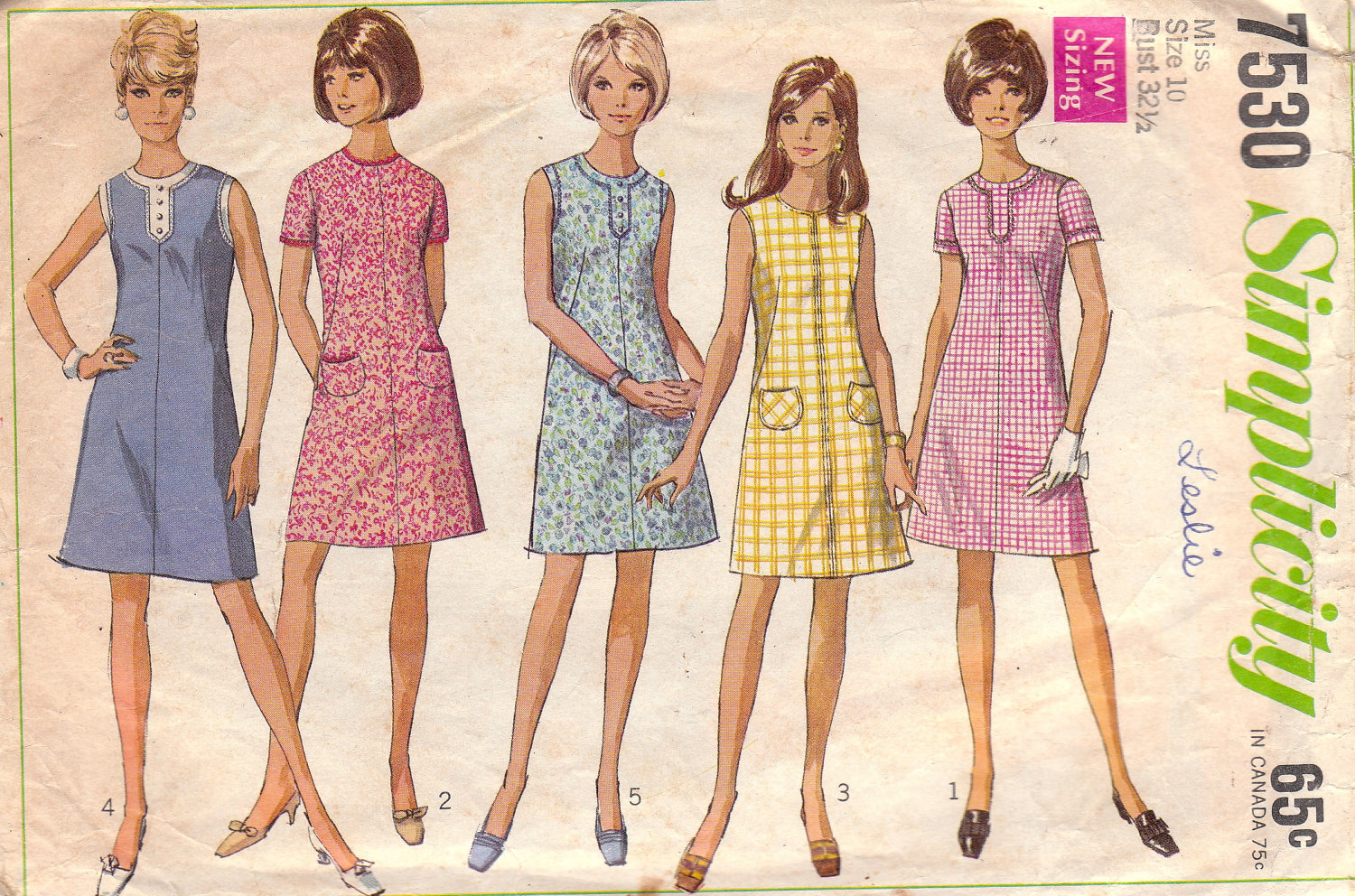
Womans fashion was more form fitting than 1950's, women were starting to show more skin
The fashion was clean cut/ conservative, which may have been thanks to the barbie faze.
Barbie came out 1959, which constantly promoted negative or unrealistic views to figures and women, this may sound bias however if you do some research on the doll around 1960's you will find out some quite shocking things for something aimed at young children
for example;
An outfit entitled 'Barbie Baby-sits" came with a small book which was called 'how to loose weight" which advised not eating, the same book was also reused in a 'slumber party set', along side the book was a weight scale set at 110 lb (or 7 stone 8 ) permanently.
Card Machines had begun to be used, giving people more money on hand to spend.
Op or optical as well as Acid colours were very popular on this time as the "hippie" or "recreational drug" based fashion was filled with psychedelic colours and patterns.
Bands like the rolling stones helped the fashion industry to start showing off legs, as well as wearing platform shoes and men having long hair, all inspired by this new peace loving phase
For some reason i could not find it within the youtube search on blogger so you get only a link.
It is quite interesting, it shows part of the life of some artists in the 60's and some possible influences including each other.
This video shows a side in which the presenter is convinced the 60's were where everything went wrong, the wrong choices were made and the wrong attitude was there, so far we have heard alot of positives from this time so it is good to look into the negatives also, however alot of it seems personal opinions, including fashion and their opinions on flats and towers are what 'destroyed' towns and centers thanks to a french architect whose idea was that homes are just 'machines to be lived in'.
1960's was a very sexualised year, sex was starting to become a more open thing, showing on movies and posters, on the down side of this women were becoming more conscious of how they looked thanks to the media portraying these slimmer models.
However there was a boom in unplanned pregnancies.
These sculptures were also made in the 60's and are still controversial to this day, however in this video it does clear a few things up, even though the presenter is pretty bias before it starts.
the artist says how he does base his work on the feminine form, he has also said that it was meant to break how artists view art, even sayin that he does not see them as women, they are just art.
A few videos would not load properly on the website i get them from however these are the ones i skimmed through, the shorter videos were watched with a finer comb.
Though i do like the acidic fashion of the 60's, however i do want to learn more about influences via television, posters and so on.
In 1950's illustration was at its most popular, the recent rationing of word war two had only just passed, the average wage in America went up by nearly 50% and people were just at awe of what to do with their spare money, shops can now get the non necessities to get more money which is why the 50's were known as the year or the consumer. Advertisement and media was ever growing in popularity and the over flow of methods of transferring Ideas, E.G. Television, Radio, Posters, Billboards, which is where the illustrators came in, using bright colours and a familiar style.
Women were overused on packaging, in my opinion this was not just to do with sexism but because the trusted house wife stereotype was in full blast, when it comes to titles such like "even a woman could do it" funnily enough those products were usually bought for women.
1956 was all about 'the king', Elvis Presley, the boom of pop culture had also started and merchandise was just going crazy! you could have the kings face on bags, shirts, about anything if you had enough money.
Though Illustrators were not only used to advertise ketchup, cigarettes and Elvis Presleys face their was a constant need for propaganda on the cold war which people were constantly blocking out to live this carefree dreamworld where there were no threats.
1958 was a time were the motion picture industry was blooming, with around 10 million homes having televisions and 5,000 drive throughs were opened (which I wish were a bigger thing in Britain but I wont complain), Illustrators were then designing posters for upcoming movies to satisfy the younger generation who always wanted whats 'new' and 'hip'.
Dr. Seuss
Theodor Suess Giesel- or Doctor seuss as he maybe known now, he used to draw political cartoons in the was before moving onto much loved childrens books, In 1955 He published 'the cat in the hat' which was most likely his most recogniseable book, I have yet to find someone who has not even heard the name, his unique style was fresh and easy on the eyes.
Gyo Fujikawa
In 1954 an article was made in an american magazine showing some of Gyo fujikawa life, born in California the article was mostly about what lead to her showing an interest in children books before writing and illustrating around 50, she did later on work at disney studios. In 1932 she went to Japan to learn techniques and just to open her mind.
Earl Oliver Hurts
Are recognisable style, soft.
Born 1898 in Buffalo, New york, he studied at Cleveland's school of art, he started to draw political and fashion illustrations.
His work was mostly associated with books and magazines, but it did not start this way, he got a job as an art director in which he found his book covers were being used in magazines without his knowledge, this of course upset him and on leaving the studio he decided he needed to become more well known as an artist, he tried to teach himself in private to improve however without deadlines or any real need to push himself his art subsequently went down hill as did his money.
An american magazine made an article on him when he started to become more active in his work and quoted that he had said he always made smaller versions of his final illustrations just to make the outcome easier or better than the first, instead of putting all of his effort into making one image right he could just practice, this is because he visited his friend while he was struggling, an art director called Chester Siebold, who told him never to make just one image, but 3 or 4 of the same image.
While world war 2 was happening, trade routes were restricted or even cut off, meaning rationing had to take affect, anything that was being sold had to be necessary, to stay running shops had to compromise, for example porcelain shops could only sell 'white ware' completely colour and patternless therefore not using any unnecessary materials.
After the bombing raids which mainly aimed at places such as factories, cultural and religious places as well as crowded areas, meant that there was a huge need for quick housing which were well made considering they were supposed to be temporary, some lasting 40 years.
1950's, also known as the year of the consumer was a big year for shops of all kinds, because rationing was no longer an issue as well as households starting to have spare money, which took a lot of self control to keep, thanks to the beauty of funny, sexist, incorrect in today's society or/and bright advertisements of the 1950's.
"In a single generation, lingering memories of the Great Depression and war were replaced by positive futuristic portrayals of the idealized modern family" Website
It was one of the first time children had started to be targetted by advertisements, 'Pester Power' had become a great way to drag parents into buying things they would other wise would ignore.
Sexism
We are all fully aware there was a lot of sexism going on around this time, women were not supposed to do any work seen as 'mans work' it was only during world war 2 where there were no men to work in the factories so women can prove themselves. it wasn't till 1960's-70's that women were treated with more respect, this was the time were the civil rights movement was in place.
Men and women had grown so used to this stereotypical house wives image of 1950's, sometimes it did get bad and objectified but because it was the norm no one really cared. this poster mas bright colours which are eye catching, and yellow is supposed to be the colour to subconsciously make you want something, however implying women are so fragile or stupid in its text will make the husband want to buy it, this means that this advertisement has been directed to the male audience more
smoking also wasn't a big deal, we know now that there are many dangerous that can happen from smoking, but back in the 50's people just didn't know or want to look into it, advertisements were positive, no one wanted to be in a bad mood because they had been passed such a bad point, the more positive sounding something is the more likely people were going to buy them.
Everything in this video was happy, cheerful and full of wonder and smiles.
For advertisement, the most common or popular sources were newspapers, magazines, radio ads, Television was like a new leaf to the industry, it was possibly the most influential factor.
Nazi Germany was as many already knew, full of useless rules to be enforced in order to make everything perfect, that meant as well as the jews, people with disabilities or different races would be rounded up and sent to camp, as well as thinkers; academics, artists, anyone who would be against or even know how wrong things were going, so many, many of them fled.
Soon a new order was passed in 1933, after the closure of the Bauhaus, for the removal of all art that would or could be classed as cosmopolitan and Bolshevik, this included abstraction in all of its forms, in total 15,997 pieces of such work was confiscated from around 101 museums, some of which were placed into the degenerate art exhibit where people were encouraged to go and laugh at all of the work.
The degenerate art exhibit mainly existed to show how no one is to fight against the government or they would be humiliated or worse, which is why people were invited into the museum in large numbers just to laugh and joke about the collected work. Everything was placed carelessly for its time, paintings leaning against the wall, crooked on the wall, writing was swayed, out of proportion or wonky, sculptures were put out of place just to make them look out of place or to make them look like trash, in our timeline this would be an exciting way to present work but back then this just represented careless behaviour or idiocy to kick the artists while they were down.
Bob and Roberta Smith
The brother and sister duo no longer work as a team, however patrick brill or better known by his alias bob, still uses the name, the contemporary artist mainly works with text and writing, his main goal in art is to show that all children should be encouraged to be creative before its too late and that the changes that are taking place should not go any further.
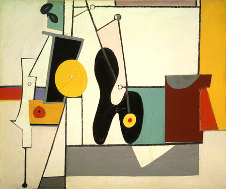
Abstract Expression
Experimented with in Germany by Wassily Kandinsky in 1919, became commonly associated with post war Germany because of the trouble some times in its history, it became a major american movement.
Influenced;
Surrealism
Cubism
It made colour and shape theory much more popular
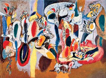
Arshile Gorky 1904-1948
His work is very similar to automatic art, where you would draw without having a set image in your head and then transform the sketches into something else, however his method was just to keep them how they were, only colouring in his work but keeping the odd shapes odd.
Jackson Pollock 1904-1948
Jackson uses his paintings to express his feelings instead of illustrating a point.
Willem De Kooning 1904-1997
Violent movement captured in his paintings, however it was thought he was a violent man around women and his own wife, sexism is strong however his work almost always shows a feminine form.
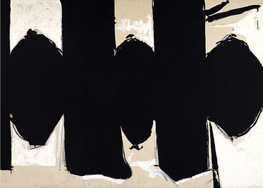
Robert Motherwell 1915-1991
Frank Kline 1910-1962
His paintings give off the impression of chalk, making marks that dont mean much, however they are huge canvases of just solid paint, the unusual shapes made are thought provocking and i personally really like it
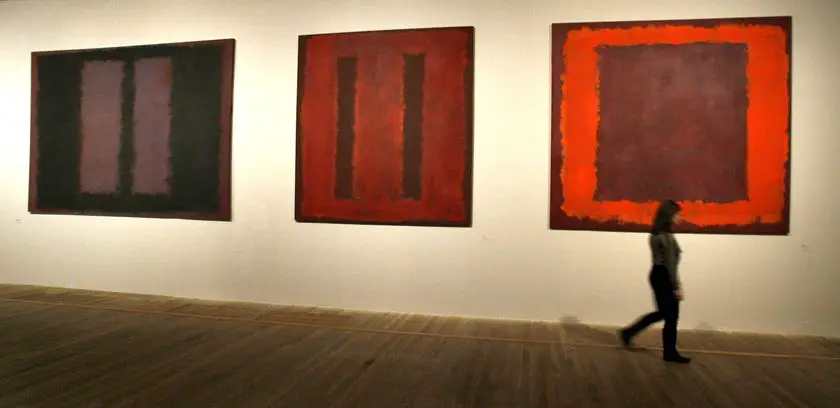
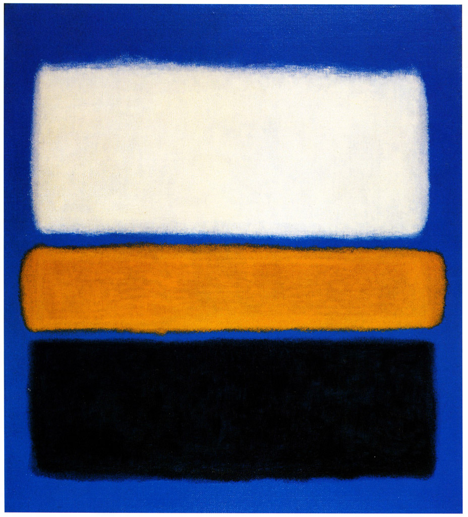
Mark Rothko 1903-1970
Jewish American artist, he would have obviously been through some of the harshest points in the nineteenth hundreds for jews, the obvious which was ww2 and the racism that happened within america.
I may try out this style in one of my plans, because it is quite thought provocking in choice of colour and shapes.
Hans Hofmann 1880-1966
Uses block colours to portray different effect, usually adding shapes to give the image more to process with our eyes
Barnett Newman
His work does seem to entirely be about him experimenting with colour theory and 'zips', the line of odd colour compared to the colours it separates- or attaches, which we can only guess was his intention, he just seems to conform or destroy the composition rules.
While looking into hand puppets and such, I came across these beauties, showing great dedication to bring inanimate objects to life, for example;
War Horse
Making of the puppet and the test runs
Just the movements and how special this sort of puppetry really is
http://www.handspringpuppet.co.za
Lion king
I was especially interested in Scars mask, as it had motion to it even though it was limited, it seemed to push forward or pull back, showing emotion even though the face itself could not move.
And i can honestly say that it has changed my final plan looking into such costumes and puppetry, I think
I continued to look for such puppet costumes and came across these;
Walter Gropius euphoria was to create an art school like no other, that would redefine art education, though he started off as an Architect, his manifesto symbolises a new and brighter faith.
At the time communism was ripe within Germany, riots were common.
"you cannot understand machines unless you have first learned of the tools in your craft" you would be taught to use tools before you would use the machinery, therefore expanding your techniques and knowledge.
He only hired revolutional painters or sculptures to work as teachers, for example Joseph Albers who studied into colour contrast and theory.
Bauhaust invented the modern day student, instead of history and artists they were taught to open their minds to texture and colour.
Too many women came to take part and had to be segregated into studio's that were more for 'woman's work' like pottery and weaving however before this, one of the best metal work students was a woman.
However in 1929, the bauhaust had been closed for the second time, students and teaches were seen as communists and held jewish ideals, which with a Nazi controlled Germany, the school was raided and used for something 'more useful'. so the Bauhaust moved to berlin. its ideals changed only because they were more focused on mass production.
An influential Russian painter born 16th December 1866 in Moscow. He studied fine art in his 30's(sketches, anatomy and colours), after graduating from the University of Moscow, studying law and economics and was offered a professorship at the University of Dorpat.
Kandinsky spent a lot of time travelling Europe in 1906 till 1908, the blue mountains was painted within this time
Kandinsky was not at all impressed by the current art regime in communist Moscow after returning their from Germany while the war had just started, he went back to Germany after his visit to Moscow to work at Bauhaust, which he stayed till the Nazi's closed it down in 1933.
Joseph Ittan -
Was born on 11 November 1888, in Switzerland. he trained as an elementary teacher and beginning from 1908 he began teaching his unusual methods of kindergarten concept which was the modern way for children to be educated, considering their capabilities and unique needs.
By 1909, Itten had enrolled at the school of fine art, however he did not stay long because he did not agree with the educators so he returned to a place called Bern. His work at Bern-Hofwil Teachers' Academy Proved Seminal since his later work at the Bauhaust. In 1919 up to 1922 he started to teach and helped develop innovative "Preliminary course" in the bauhaust this course meant to teach the students the basics of material characteristics, the composition, and to use colour, also in 1920 he invited Paul Klee and George Muche to join him.
Surreal basically means unexplainable or different, it is made from super-realistic even though the things it is used for are usually so odd and strange they are almost the opposite. It became more of a productive movement between the first and second world wars, like dada however, surrealism did have a few more rules and principles to follow.Dada was born from the negative emotions gathered from WW1, it started from a group of artists and poets associated with the Cabaret Voltaire in Zurich. some believe the name is Russia's meaning of 'yes' da da, 'да да' would mean yes yes another theory from wikipedia would be 'that the name "Dada" came during a meeting of the group when a paper knife stuck into a French-German dictionary happened to point to 'dada', a French word for 'hobbyhorse'
super realism truth beyond the real
Alfred Jarry
Alfred Jarry was a talented writer slightly before the estimated date of the surreal movement in1920, but still managing to be relevant thanks to his symbolist work between 1873-1907.
Perhaps his most recognisable piece was Ubu Roi, which is described as 'absurd' at the time because such act of random humour had never been preformed in an open theatre before, shortly after the play had been preformed it was not or revisited until after Jarrys death. Even so the play had brought fame to the 23 year old, and with time he became his creation, speaking in the odd ways of ubu, for example he would speak of the wind as 'that which blows' and his bicycle 'that which rolls'.
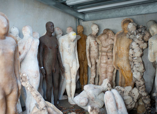
Anthony Gormley's still life work is all (or mostly) made from him being covered from head to toe in plaster by his wife, he finds the human body sacred almost, saying how it is "a vessel for personal space", that skin is not the beginning or end of our bodys. The 20th century the human form was mostly used in art, however it was mainly women, children playing or soldiers, slightly generalising it. Dave Nash An artist who uses Art Nouveau, using natural forms to create pieces of art, in his case instead of being inspired by it (though he may still be) he uses natural forms to piece together his pieces.
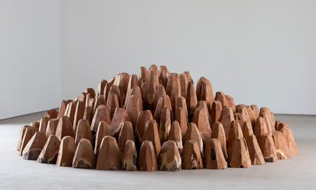
He does tend to stick to primary elements, shapes such as triangles, squares and circles, they are powerful shapes which are easily recognisable, however combining them or changing the placement of any single shape will give an unusual effect, even a texture without you needing to touch it.
This piece is known as 'Pyramid' and are made from a single Oak tree around 400years old, which he Charred, treated them with linseed oil then does the same things again to give such effect.
Eglin Marbles
There is no doubt in my mind that you have seen or heard of this collection of classic Greek Sculptures, they are usually pictured as pure white sculptures that look near perfect
They are only pure white now because that is the way Thomas Bruce, 7th Earl of Eglin wanted them to look, as they were originally brightly painted, almost 'cheery' looking for what they are
The act of cutting off pieces of marble sculptures, stealing them from their resting place, and removing the paint were illegal and acts of vandalism against the monuments of significant historical value. Greece continues to fight to this day for the sculptures to be returned to their home.
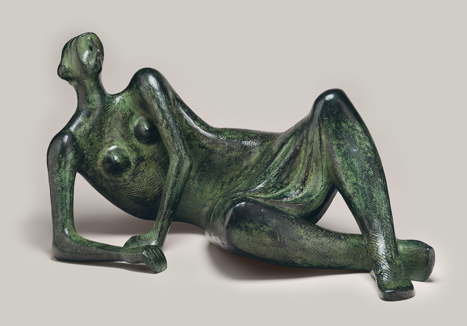
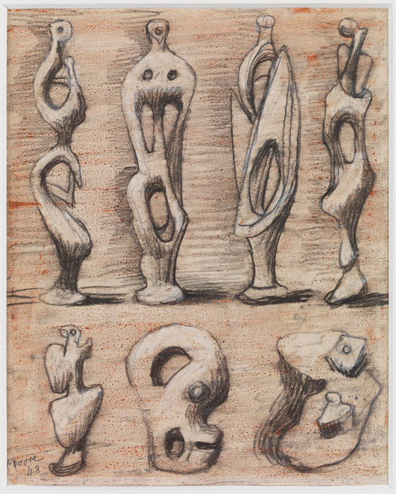
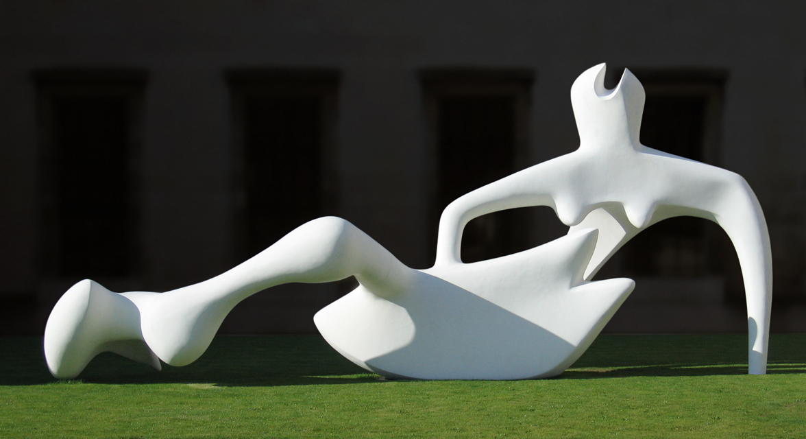
Henry Moore
Best known for his abstract human body work, which were usually based on women figures or reclining figures. Henry Moore was an English artist who was born in 1898.
His talent first showed while he was attending infant and elementary school, where he learnt how to use clay and carve from wood which he seemed to enjoy, by the age of 11 he decided he wanted to be a sculpture after hearing about Michelangelo's Achievements (best known for his statue of David).
I do like his work, its appearance is so smooth and fluid, it appears so simple however each work he did started off as sketches before they blossomed into something more.
Anthony Caro
whose work was abstract and almost futuristic, using simple shapes to make a more detailed piece of art, by 'simple shapes' I mean most if not all parts were found industrial objects. He had worked with the abstract artist Henry Moore earlier on in his career.