Showing posts with label Posters. Show all posts

Monday, 29 June 2015


This was the image I used, my first job was to get rid of the background and try to lighten the image,

While trying to get rid of the background i accidentally used content aware which tries to fill in the selected areas with was it is surrounded by, in this case it was me.
after doing what i said i would do i also tested with the liquidise tool to stretch certain features


Inspired by a mixture of borderlands 2 and tell tale games just for a tester, it looks messy and interesting but i will not continue with this.


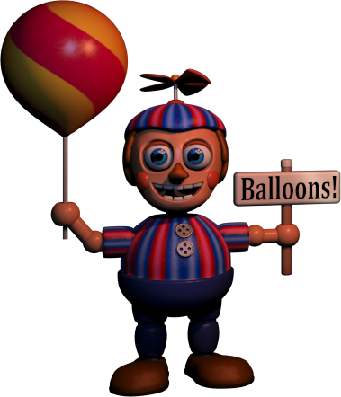
I decided to be different and instead of just trying to make myself magazine print-able i decided to become like the stories I write, a monster, in which i put my face on the balloon, though i could only get one of my eyes so i duplicated the same eye and flipped it round, it may not mean i can look in one direction but it certainly is eye catching!


because my comics are in black and white i thought it would be the best idea for myself to be black and white too, the way i did this was to go into image, mode then greyscale before putting it back to RGB, this is so that i can save it properly.


here was my first attempt at the cover, i think the cover itself is great but I needed it to be more extreme and scarier, so I went back to using the liquidiser tool an artist showed me in photoshop


Tested the tool out first, it was fun to use, and made it quite simple to over lap images, I morphed this image with my face.

I decided to mess around with my balloon face and liquidise tool to make it look more monster like and spooky! think I did a good job but if I were to do this again I would take more photos of my expressions so I could test them out!


Wednesday, 17 September 2014

Research in H+S


Warning symbols for chemicals, they can also be found in the workplace, for example some buildings still have asbestos in and people must be carful of that, as well as the other possible materials used past and present.


A more comedic poster, an uplifting view of the negative, people will be more likely to check it out because of the mere thought of 'hey look a gorilla' and may subconsciously be influenced to read why he is there, use of digital and photos have been used for this, a catchy phrase to remember.


A dark cartoon, even though everything is exaggerated and made to look silly, it is still showing violence and possible problems in the work place around machinery, a good method of getting a certain point across.


Funny posters to show our faults compared to animals strengths, it is a clever way of getting a point across, especially with the 'you're only human' on the bottom of the page

A simplified and exaggerated cartoon poster about back strain, i like the colours chosen, you can easily see what point it is trying to say not just in the writing but in the image, the huge zig zag down his middle to show serious injuries.


I like the colours and style chosen, very simple but the dark on bright makes it stand out well the warnings are easy to work out


using the shock tactic, showing an injury due to someone not paying attention to health and safety is always a good way to get the attention, it sends shivers up the spine and causes people to worry- though this is very rarely a good thing, especially in the workplace- however it somehow works.