Showing posts with label Textiles. Show all posts

Monday, 27 April 2015

Visit to Liverpool

We are planning to go to Liverpool to look at different galleries and museums as well as visit Anthony Gormleys installation piece "Another Place" which are 100 cast iron men, made in his image, placed in many locations along liverpools beach, as the water goes out the figures become visible, as the water comes in their heads are menacingly watching out at the on coming water.


Here are some of the photo's I took;


But first we will be visiting The Walkers Gallery

I would like to find "Peter Getting Out Of Nick's Pool" an acrylic painting on disblay from 1966, by David Hockney as well as other paintings.


Albert Richards born 1919 in Liverpool, he studied at Wallasey Art School. However he was soon called upon for his services in the war, he painted whenever he could, trying to capture army life, this painting was called the seven legends self portrait.


David Bomberg 1948


Art Deco 1920


Nightfall, Luxor 1910
Sir David Young Cameron, Scottish artist in 1865-1945.


Summer lighting
Walter Richard Sickert 1860-1945


A struggle for existence

A size comparison


Gliders


Love and the Mermaid, plastered in 1895, cast in 1896 by Charles John Allen, a liverpool sculptor.
Green marble plinth

Peter Getting Out Of Nick's Pool


Next we will be visiting The Blue Coat Center, A gallery dedicated to contemporary crafts and designs since 1959.


Sunday, 19 April 2015

Show biz

Here is a tester with the Dogs I had finished, my glamorous assistants seemed to enjoy themselves while chasing each other around, it was also fun to watch so I think this would be the better idea instead of using them as wall decorations.
From this I made more dogs that would be either side of the person instead of only one side, this is entirely for convenience. 
Here are the dogs in action, I think it went well however there was a late minute change of plan for where two of the dogs would be walking, they walked round twice before waiting till their time to run down the middle to Diana (Kim in the nature themed dress).

Tuesday, 10 March 2015

1960's

In my opinion was the year of the extreme, everyone wanted to compete, weather it was to create the most powerful weapon or if it were who was going to first land on the moon.

Womans fashion was more form fitting than 1950's, women were starting to show more skin

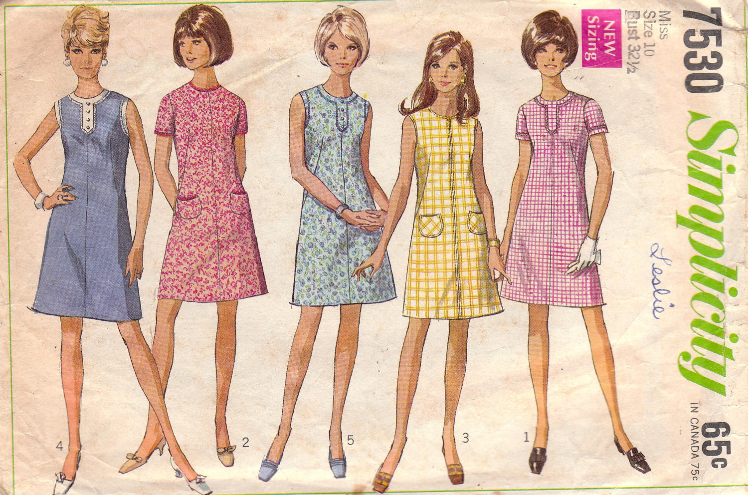
The fashion was clean cut/ conservative, which may have been thanks to the barbie faze.
 Barbie came out 1959, which constantly promoted negative or unrealistic views to figures and women, this may sound bias however if you do some research on the doll around 1960's you will find out some quite shocking things for something aimed at young children
for example;
An outfit entitled 'Barbie Baby-sits" came with a small book which was called 'how to loose weight" which advised not eating, the same book was also reused in a 'slumber party set', along side the book was a weight scale set at 110 lb (or 7 stone 8 ) permanently.


Card Machines had begun to be used, giving people more money on hand to spend.

Op or optical as well as Acid colours were very popular on this time as the "hippie" or "recreational drug" based fashion was filled with psychedelic colours and patterns.

Bands like the rolling stones helped the fashion industry to start showing off legs, as well as wearing platform shoes and men having long hair, all inspired by this new peace loving phase


For some reason i could not find it within the youtube search on blogger so you get only a link.

It is quite interesting, it shows part of the life of some artists in the 60's and some possible influences including each other. 


This video shows a side in which the presenter is convinced the 60's were where everything went wrong, the wrong choices were made and the wrong attitude was there, so far we have heard alot of positives from this time so it is good to look into the negatives also, however alot of it seems personal opinions, including fashion and their opinions on flats and towers are what 'destroyed' towns and centers thanks to a french architect whose idea was that homes are just 'machines to be lived in'.

1960's was a very sexualised year, sex was starting to become a more open thing, showing on movies and posters, on the down side of this women were becoming more conscious of how they looked thanks to the media portraying these slimmer models. 
However there was a boom in unplanned pregnancies.


These sculptures were also made in the 60's and are still controversial to this day, however in this video it does clear a few things up, even though the presenter is pretty bias before it starts.
the artist says how he does base his work on the feminine form, he has also said that it was meant to break how artists view art, even sayin that he does not see them as women, they are just art.

A few videos would not load properly on the website i get them from however these are the ones i skimmed through, the shorter videos were watched with a finer comb.
Though i do like the acidic fashion of the 60's, however i do want to learn more about influences via television, posters and so on.

Sunday, 4 January 2015

Puppet

Marionette are puppets controlled by String or wires depending on region.
All that I could need to make a 'base' for my puppet would be;
  • Newspaper
  • Wire
  • String
  • Wood
  • Papiermache/ mod rock


My first attempt at making a marionette puppet, I have noted that even though the wire used was easy to bend, it was also easier to break or come loose, therefore I must use stronger wire for my next attempt.


This was me making my second marionette, this time some parts had thicker wire, such as body, and legs though this did mean it was very hard to work with and took me some time!
I am happy with how it came out however it did take up alot of time.

Tuesday, 2 December 2014

Evaluation of things

 Victor and Albert Museum
 
1991- By Bread and Puppet Theater 
 
   These Papier Mache puppets may appear rough, but many of the pieces in the exhibition were produced under pressure and limited resources, It was made as a response to the Iraq war. 'Black Clad Iraqi Woman carrying a corpse to chime ringing, followed by the white-gloved businessmen marching to snare'.
 
From this I started a new outlook, still following the path of puppets although this time, it is best described with a sketch


My Idea Is to make a costume, one side would be dark, scary looking while the other would be a feminine and colourful, a 'normal' dress in comparison to its other side, I would also where make up to carry on the illusion, the two sides are to represent the two sides you see of Diana the goddess of the hunt, one side you have a beautiful woman, but on the other side you have her hate, and the side that actaeon see's, the puppet is to represent how actaeon was never truly going to get away, the dress would carry on but the trail behind the dress would be a shiny red velvet to give the illusion of blood as a Deer puppet is dragged along ontop of it, showing actaeons death.


These are a few of the dresses I liked the look of in the museums, I have got many ideas from these to help towards my outcome, for example the plans for the 'creepy' half of my costume, how it will look, should it be a poncho, something attached or something draped.

#My Product#


My first  practices of the Title for my product, using the names of the characters instead of creating something new because I wanted it to be catchy, relevant and cute, the names Hush & Shush worked well because 


A few InfoGraphics I did in Adobe Illustrator, to show the use of my product, the last ones are the ones I stuck with because they are simple and friendly looking.

For each box, the girl will have a different coloured shirt depending on the secondary colour of the packaging (AKA the colour of the flaps and writing.)


The first design of my product, I chose a handwritten looking type face and simply change the & into a friendly character, at the time i felt it was cute and cleaver but now I realise it wasn't very  impressive, that and some people may stubble to distinguish between letters, I know what it says because I wrote it but it would probably be a problem in later development and testing.
I wanted to use a simple box template for my product because I wanted to focus more on the graphics, for example the title and imagery that will cover the friendly box.


Second design for my product packaging, I decided to write my own font, trying to make it look friendly and cushioned, huggable, knowing this i was trying to make the text thick, and thanks to my inability to write anything in a straight line it would make it look bouncy, as the letters are not on the same level.


My Final (hopefully) Packaging design, 


Special Editions

For Pine I felt it would better suit christmas, as it tends to be pine trees that are put up in the middle of houses and decorated festively, red being the current colour of santa's crown though it did used to be green, so to stay with the times i decided Red would be the best secondary colour for it. the brown actually being taken from a mixture of images of pine cones.

A valentines Edition, because who wouldn't buy their sweet heart something cute and cuddly?
The Primary colour was taken from a rose, the secondary colour was taken from the leaves to show relevance, lucky I have the eye drop tool, I wasn't expecting to get this colours I am actually quite happy that I did.