Showing posts with label designs. Show all posts

Sunday, 26 April 2015

Plans and practices

Here are my practices on the Canvas' I made using MDF cut 44 width and 61 length, then covered by a strong durable fabric over one to make a canvas, the other remained without the fabric to test texture and to just make sure it was the right effect.

 This one was first to do, I used just the primed MDF board for this, I also tried to do a Jim Dine technique for the background to keep it visually stimulating, i liked the idea of now worrying about the colours within the colours, for example if you look at some of the yellow boxes you will see some blues, pinks and browns mixed in almost carelessly, but it did give off a nearly 3D effect, however if i were to do a similar background in the future, i would not use the dabble technique, it doesnt look right so i will keep it smooth.

Then I had Julian Opie faces, or tried to, with the very limited details on the face, it was almost the exact effect i wanted, though i wish the lines were darker. One thing i am disappointed with is how small i made the faces, yes i wanted the background to be visible but now there is too much background, so for my next idea i will make sure to make the characters alot bigger!

I have decided to keep the lips big and exaggerated as my sort of signature mark that people may recognise.

This was from an argument between Danny Dyer and katie hopkins in which he called her a tampon with a face after she lashed out at his fiancee

“Last one.....as I'm in a jolly good mood.....imagine if a tampon was to have a face......@KTHopkins happy Tuesday. ;)”

I erased the last head and body because of my previous review of it being too small, though the lips weren't as realistic, but in my eyes it looks like he is pouting which is funny to me.
From some research i did later on I went back and edited the background so that it would have these thick black lines, however i found it blended in too much with the lines in the faces, clothes and tampon. I would need to take this into consideration for next time.


In a tweet from Katie Hopkins she said that if Ed Miliband was voted the new pm she was going to leave the country, i found this funny because some people on the internet would then intentionally vote for him to spite her making it a possibility.
I first decided to blend some colours,  thought that this effect looked interesting and simple, i dragged the brush off of the page in a curtain angle and added a bit of colour each time without cleaning the brush, though this also lead me to another idea;

I decided to try and make a universe, seeing though Ed was stood on the world with Katie running away, it would only make sense for their background to be the universe around them, though this makes it too literal, so instead i tried to find a different background type in which it emphasises the people and does not make them blend in.

 To simplify the background i used a technique of another artist; Kim Moore, one of her techniques is to scrape paint onto canvas with a spatula, giving a textured effect which i wanted to try and replicate, I think the paint was too watery and you could still see the failed attempt at a universe in the background lightly, though i do not mind it, it gives an added colour, i had fun using the spatula though i do not think i will use this technique again.

However, when I left it to dry it dribbled from the angle it was at, though it looks interesting, it was not what i wanted to happen.


This one is not finished however I tried to do a different background to the first image, trying to use black and white to emphasise the colour in the foreground however i am not sure it is right, perhaps i will keep the idea for a future design except keep it more the patch work style of Jim Dine instead of the floating TV screens we see here.

I did learn from my mistakes last time and made the characters alot bigger to take up more space, even giving them a more unusual position to make them more visually pleasing.

This Idea is from a celebrity argument between Katie Price and Katie Hopkins, in which Katie talked to the press saying 'I bet she doesn't even wear face cream' which i found hilarious because it just wasn't the sort of back talk you would expect. At the moment it seems to be a series of Katie Hopkins seeing though so many people make ridiculous comments.

I do think i will stick to celebrity arguments or social networking posts for my final piece.

I decided this would be my final piece once finished.


Here is the finished piece, i decided to change the background to grey so that it did not draw attention from the main image however i also changed the lines to white to make them stand out against the black

Facebook page's banner which I designed with my mascot Birdie.
I am starting to like the light blue lines with the text and birdie, I have used it in my concept sheets as well and the consistency of this is very appealing


I edited Groovy goose, I got rid of his legs and stretched his neck so that he would resemble a goose more


I have realised that I have been using the wrong busy birdie sign, this mistake is a bit of a pain but means I must be more careful when placing designs


This is my Facebook page's QR code, if you have the app on your phone you can scan it and go straight to the website

Monday, 13 April 2015

Line art


In my search for coloured outlining tutorials i came across this, tough it didn't do exactly what i wanted it would be useful to look back on as i do like this sort of bold out line around the whole image.


This one is near enough the same as the one before except more to the point, it is easier to understand and i am more likely to use this one in the future.


Sunday, 29 March 2015

research into hidden messages in logos

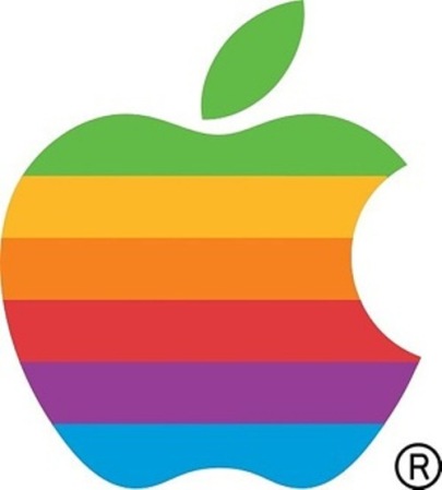
The Rainbow Apple of 1976-1998

The rainbow apple was scrapped as it was seen as too expensive to continue.

There were rumours that the bite in the apple was showing respect to the 'inventor of the internet' Alan Turing, who was sentenced for 'homosexual acts' which in 1952 were criminalised, he later committed suicide by eating a cyanide laced apple in 1954.
Though they were laughed at as being just “What a wonderful urban legend.” by the creator of the logo Rob Janoff
According to him the bite was simply a play on word for byte, a unite of information in computing.

but there is also something else hidden in that logo, a phone, from the two empty notches to it, the bite and the bottom of the apple.

Personally I really like the logo and how simple yet thought provoking it is, I'm not sure how I would want to add this sort of idea to my work.

More illustrating text than a logo, the arrow pointing from A to Z meaning easy or simple, or just having a range of products from A to Z, but the arrow could also be a smile, which I find an adorable idea, I do see something like this for my brand name, I do like using illustrating text from time to time.

As well as the obvious there is also thought put into the colour, black writing usually shows sensible, or once again straight to the point, though the yellow arrow shows more of a fun and 'sunshine' message

Tuesday, 24 March 2015

my brand


This is a sketch i worked on for my product designs for my Teddy bears, the first image i did by hand, the second is when i scanned and cleaned it up a little
my idea was of course to join Shush together, but at the time i had ran out of space on my paper, and so i don't squash the letters i decided to just join them later.


this is what I got after i had gone over my designs on illustrator, i did this on illustrator instead of photoshop because i wanted the nice smooth lines, because I was advertising teddy bears, which are soft and friendly.

the & was merely a practice for illustrating text, showing it as a character as well as something with meaning.


I soon decided that having these seperate brands was too complicated for what i wanted, so instead I came up with making one brand but using play on words as the designs, for example Groovy Goose, Devil Duck, Pink Pigeon and so on would just be designs for the shirts not the over all brand.


Here are my practices and final design, which was done by hand, hiding a bird within the text to link back to my research on logos with hidden meanings


Here are a few of the designs on T-shirts, most I would like to keep except the image below v

An attempt at comedic design however I dont think it looks as good as the others

Sunday, 15 March 2015

T-Shirts


I personally love weird fish designs, and their logo, which is easily recognisable as a weird fish.
or a skeleton of a fish, the sketchy writing is also weird in a sense it seems hand written with a slightly shaky hand.
'Live Life Your Way'
A very positive message to send out, and catchy, people may subconscious remember the quote but not link it with weird fish as i do.

http://www.designious.com/t-shirt-designs
This website has many cool designs to buy, they are not all characters, which makes me think i should not box myself in with only caricature designs, i will probably come back to caricatures with time but right now i need to broaden my search

http://www.redbubble.com/shop/womens-tshirts?ref=home_leftnav https://www.etsy.com/uk/search?q=t-shirts 
Redbubble and Etsy are both better known to me, though they do not all look into T-shirt designs only, which is what i like about them, usually their are alot of work based around certain fandoms (fans of TV programs or webcomics/videos on the internet) for example a character on a T-shirt will be from that particular show or be 'fan made' E.I. based on the universe of the show but not in it.

Tuesday, 10 March 2015

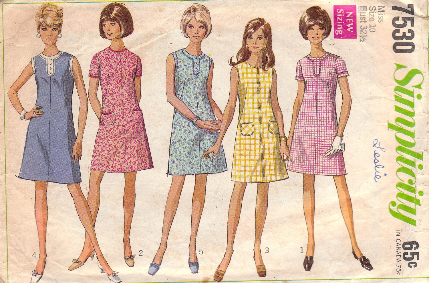
1960's

In my opinion was the year of the extreme, everyone wanted to compete, weather it was to create the most powerful weapon or if it were who was going to first land on the moon.

Womans fashion was more form fitting than 1950's, women were starting to show more skin

The fashion was clean cut/ conservative, which may have been thanks to the barbie faze.
 Barbie came out 1959, which constantly promoted negative or unrealistic views to figures and women, this may sound bias however if you do some research on the doll around 1960's you will find out some quite shocking things for something aimed at young children
for example;
An outfit entitled 'Barbie Baby-sits" came with a small book which was called 'how to loose weight" which advised not eating, the same book was also reused in a 'slumber party set', along side the book was a weight scale set at 110 lb (or 7 stone 8 ) permanently.


Card Machines had begun to be used, giving people more money on hand to spend.

Op or optical as well as Acid colours were very popular on this time as the "hippie" or "recreational drug" based fashion was filled with psychedelic colours and patterns.

Bands like the rolling stones helped the fashion industry to start showing off legs, as well as wearing platform shoes and men having long hair, all inspired by this new peace loving phase


For some reason i could not find it within the youtube search on blogger so you get only a link.

It is quite interesting, it shows part of the life of some artists in the 60's and some possible influences including each other. 


This video shows a side in which the presenter is convinced the 60's were where everything went wrong, the wrong choices were made and the wrong attitude was there, so far we have heard alot of positives from this time so it is good to look into the negatives also, however alot of it seems personal opinions, including fashion and their opinions on flats and towers are what 'destroyed' towns and centers thanks to a french architect whose idea was that homes are just 'machines to be lived in'.

1960's was a very sexualised year, sex was starting to become a more open thing, showing on movies and posters, on the down side of this women were becoming more conscious of how they looked thanks to the media portraying these slimmer models. 
However there was a boom in unplanned pregnancies.


These sculptures were also made in the 60's and are still controversial to this day, however in this video it does clear a few things up, even though the presenter is pretty bias before it starts.
the artist says how he does base his work on the feminine form, he has also said that it was meant to break how artists view art, even sayin that he does not see them as women, they are just art.

A few videos would not load properly on the website i get them from however these are the ones i skimmed through, the shorter videos were watched with a finer comb.
Though i do like the acidic fashion of the 60's, however i do want to learn more about influences via television, posters and so on.

Sunday, 22 February 2015

2D sculptures


Small Paper machettes as practices


Update; I am enjoying making these 2D sculptures, i as an aspiring illustrator love to draw, I do admit i like my wolves and german shepherds but looking back on my previous work i decided it would be best to make beagles, not because their cute little dogs, but because they are well used hunting dogs, even today.

To keep the figures 2D I made them completely one sided, you can only see their left or right side, no not both and no over lapping, except the tail and horns but i find that necassary.

My idea is, instead of a final performance or single sculpture was to have a performance photograph, to make the sculptures look as if they are moving. However I am nervous about being a sort of 'Director' for this photo, Im not entirely confident with telling people what to do or where to stand.


I have decided to keep the deer white because of an article I saw not to long ago about an almost legendary Albino Moose in Norway Named Albin who was shot dead not long ago


A definate health and safety for this new material which is very smooth and a sturdy material would be to wear gloves because we are using knives and the corners can also become very sharp on the sculptures.
also because of its smoothness it was a pain to paint, 3 coats in and i can still see sketches.


I have been thinking on ways to hold the sculptures in the photo, i have had two ideas, fabrics to make it hang or some sort of handle, for example toilet roll tubes, 

Friday, 13 February 2015

Sketches


"A torso fleeing from grabbing hands, to symbolise how vulnerable Diana felt when Actaeon walked in on her"

"A monster like torso which would be a metaphor for the sheer terror Actaeon would feel when he realises what he just walked in on"


"A face squished between two horns as if forced to see through, I could also use hands instead of antlers- as if peeking"


"Pokemon- A franchise that pretty much revoves around change, something small can evolve through fighting to become something stronger, this also could be a reason to look into Charles Darwin's theory of evolution"

"Kelpie, Scottish Lore- A shape shifting water spirit that inhabits lakes, pools and locks on scotland, usually depicted as a beautiful horse that fools people into riding it before it will drowned them in the near by water source. This is another example of change"

I recently watched spirited away, a Japanese movie by Ghibli Stubios, I felt it could relate because the change that happens within the characters, for example the main characters personality changes from self-centered to the understanding young lady lady at the end. The character here also changes from murderous to quite loveable"


Plan sketches for a possible out come, a moveable puppet like head dress, inspired by no-face from spirited away however i was having quite a bit of problem with motivation and i just didn't think it looked the part.


This is what i started to go more in depth to, i was quite enjoying working on it too, my idea was to have a doll like mask covered by a black veil with only two mod rock eyes visible through it, it would be a performance piece, when i got to the end of the catwalk i would then lift the veil to expose the eery face.


____________Final Ideas and Reviews______________