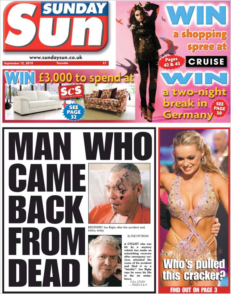
Title in top left corner, this is more common than i thought, examples Daily star, Daily mirror.
Its a subtle way of drawing your attention to the articles then to the title, thus you by the paper for the content.
I have also known the longer bar down the sides, this can change from the left side to the right side but the larger box takes up both the opposite side and the middle and is normally crammed with the most eye-catching stories. Advertisement either takes up the top bar of the thinner side bar.

The guardian paper is rather dull looking- all factual and no fun, i personally would not take it from the shelf though i do think its logo is a little more creative than- everything else but not by much.
the text is small and cramped, makes you think they must exaggerate more.
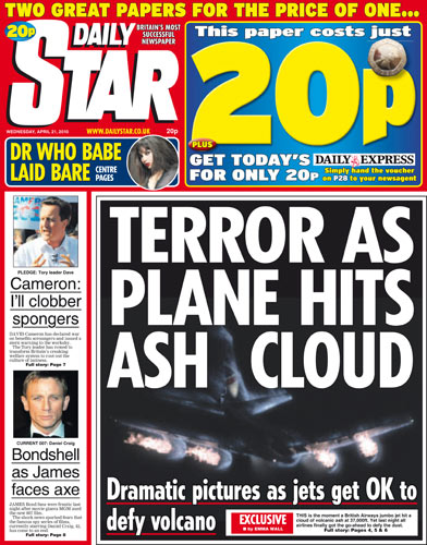
once again the title is in the top left corner with bold font, however the bright colours against the dark make it stand out a little more.
No comments:
Post a Comment